Olive is a web application designed for health-conscious individuals, providing them with convenient access to their health portal. The app provides an easy way to store medical records and manage their doctors, clinics and appointments. It offers resources to learn more about wellness and health.
Design Inputs
Problem Statement
Allow health-conscious individuals to log in to a responsive health and wellbeing portal to record their health and medical information, and access general physical and mental wellbeing features.
Design Criteria
Design for a specific circumstance: Many individuals have high-stress jobs and no time for "work-life balance." This portal will make staying on top of wellness, health, and medical needs that much easier.
Design for inclusivity: Not everyone is built the same, and users have diverse physical and social circumstances. Consider a design that caters for those with physical, psychological, and social needs. Inclusive design allows for online tools to reach more people who would benefit from their services.
Educate the user: Not everyone knows how to change their behaviours or create healthy habits. This portal will offer support to users to help them on their journey to a more balanced way of living.
Remember privacy: Health and medical information is very sensitive. Make sure your users' information is safe so they can feel reassured when using your product.
Five Ws
Who?
Health-conscious individuals with access to the health and wellbeing portal.
What?
An inclusively designed responsive web portal (app) that provides health and wellness information, as well as a way for users to store health and medical information and appointments.
When?
Users visit the portal whenever they want to access its health and wellbeing features or to update their medical records.
Where?
Users can access the web app on any device that has a connection to the internet.
Why?
Users want an accessible one-stop spot to access health and wellness resources alongside their own health and medical information.
Requirements & User Research
Preparing Requirements & User Stories
The initial input for Olive was two documents of business requirements from the customer.
To be able to track the relationship of requirements to their implementation and changes over time, I formalized them by breaking them down into atomic sentences and assigning a unique identifier to each requirement.
To simplify the verification, the list of requirements has been designed as a checklist.
To simplify design, concise requirements have been expanded into more detailed user stories each with its own identifier and tied to the original requirement.
App should be...
- designed as a web-app and able to open on any device that has a connection to the internet [ID: 1]
- designed as a responsive app [ID: 2]
- inclusively designed [ID: 3]
- able to provide a high degree of protection for sensitive user data [ID: 4]
- having gamified components (optional) [ID: 5]
- having an onboarding page [ID: 6]
- having a way to sign up and log in [ID: 7]
- having a home screen or dashboard [ID: 8]
- having a menu to navigate [ID: 9]
- having a possibility to store user's health and medical information [ID: 10]
- having a possibility to store user's appointments [ID: 11]
- having an education and training feature [ID: 12]
App shouldn't be...
- a native mobile app [ID: 13]
- having too many features [ID: 14]
Understanding the User
A scripted interview was conducted to better understand the users. All results were collated using stickers and affinity mapping.


Data Review Participant 1
Ideation
Creating Personas
Creating personas after user interviews in UX design is essential for distilling and consolidating user insights. These personas provide a shared understanding, guide design decisions, mitigate biases, and facilitate scenario planning, ensuring a user-centric effective design process.
After analyzing the interview data, I created two personas to guide the design.


Persona #1
Developing User Journeys
Creating a user journey after developing personas in UX design is crucial for a deeper understanding of user experiences. It helps identify pain points, ensures a seamless integration of touchpoints, and provides opportunities for innovation. By aligning the design with business goals, user journeys support an iterative design process, allowing for continuous improvement based on user feedback and changing requirements.


User Journey Nora
Performing Card Sorting
Card sorting, following information architecture in UX design, ensures user-centric organization by validating and optimizing the structure. It identifies potential ambiguities, informs content labeling, and supports an iterative design process, involving users in ongoing refinements for an intuitive and efficient user experience.
Informational Architecture before Card Sorting

Optimal Sort Results


The online application OptimalSort was chosen for card sorting.
Recruitment of participants was organized through my personal accounts in social networks. A total of nine people responded, and five of them sorted all the cards.
I tried all the analysis methods available in the application and made several standardizations. The clearest result for our sample came from the Dendrograms visualization, which shows how close different cards are to each other. The Best merge method was chosen because my study has few participants.
You can see on the Dendrogram how the cards are grouped. Generally the grouping is similar to mine. The only noticeable difference is the grouping of cards from the Education and Help sections.
After card sorting by participants, it became clear to me that category names play a very big role. Names must be unambiguous for users. When I named categories and assigned them to sections, I unknowingly added the section name to the category name, but I did not always write them down.
For example, the Examples category was intended to be part of the help, something like How-To. When it is in the Help section, it is clear what is meant. When a participant only sees the word Examples, they don't know what it refers to, so they may think it's examples for something else.
Informational Architecture after Card Sorting

Sketches
Drawing Sketches
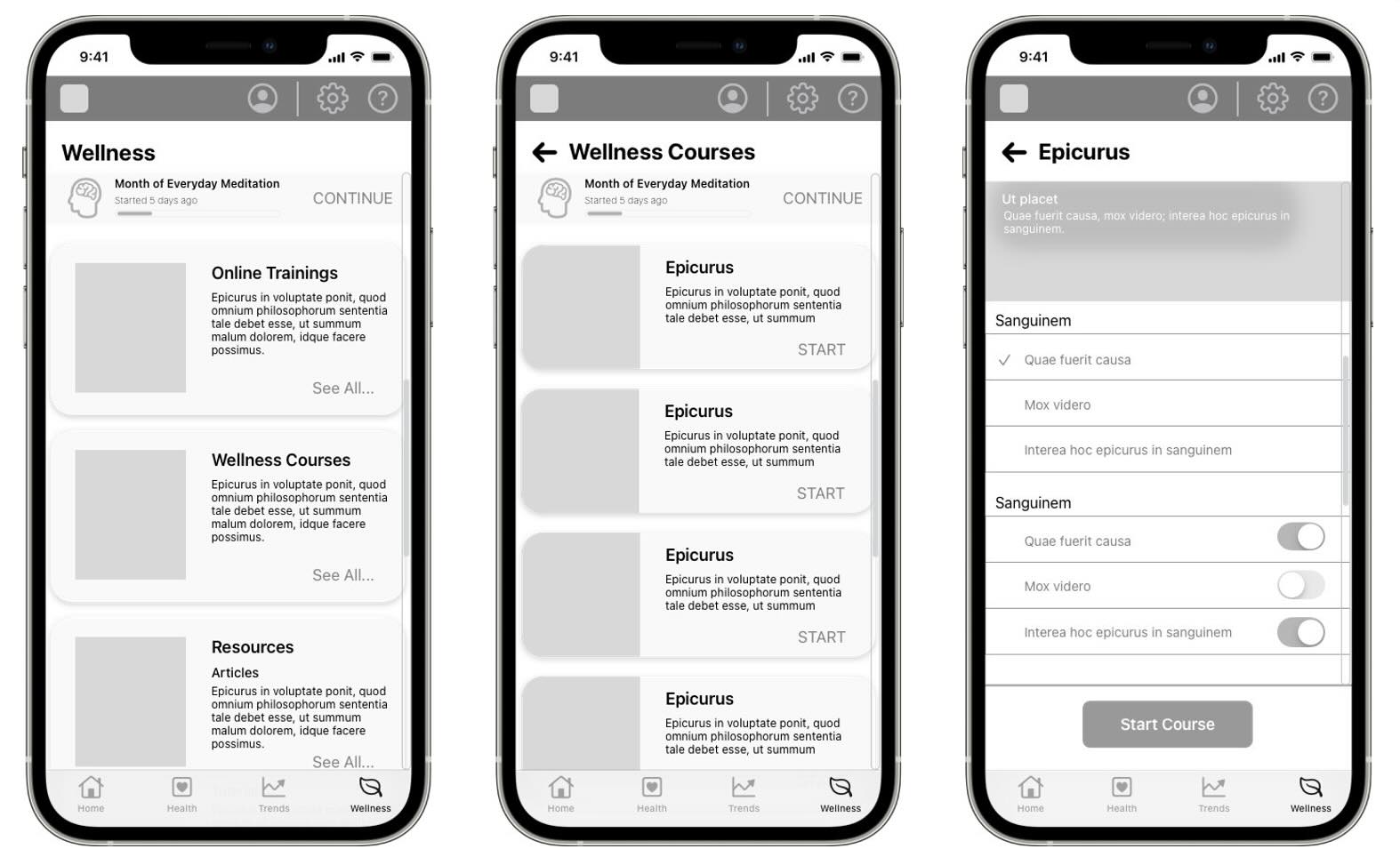
Creating low fidelity sketches post-information architecture in UX design allows for rapid conceptualization and iterative exploration. Focusing on structure and flow, these sketches serve as a cost-efficient communication tool for collaborative discussions and early user feedback on essential design elements.
I tried drawing not on paper, but on a graphics tablet in software that simulates drawing with markers. This approach combines the advantages of rapidly capturing ideas and being able to reuse well-crafted elements.
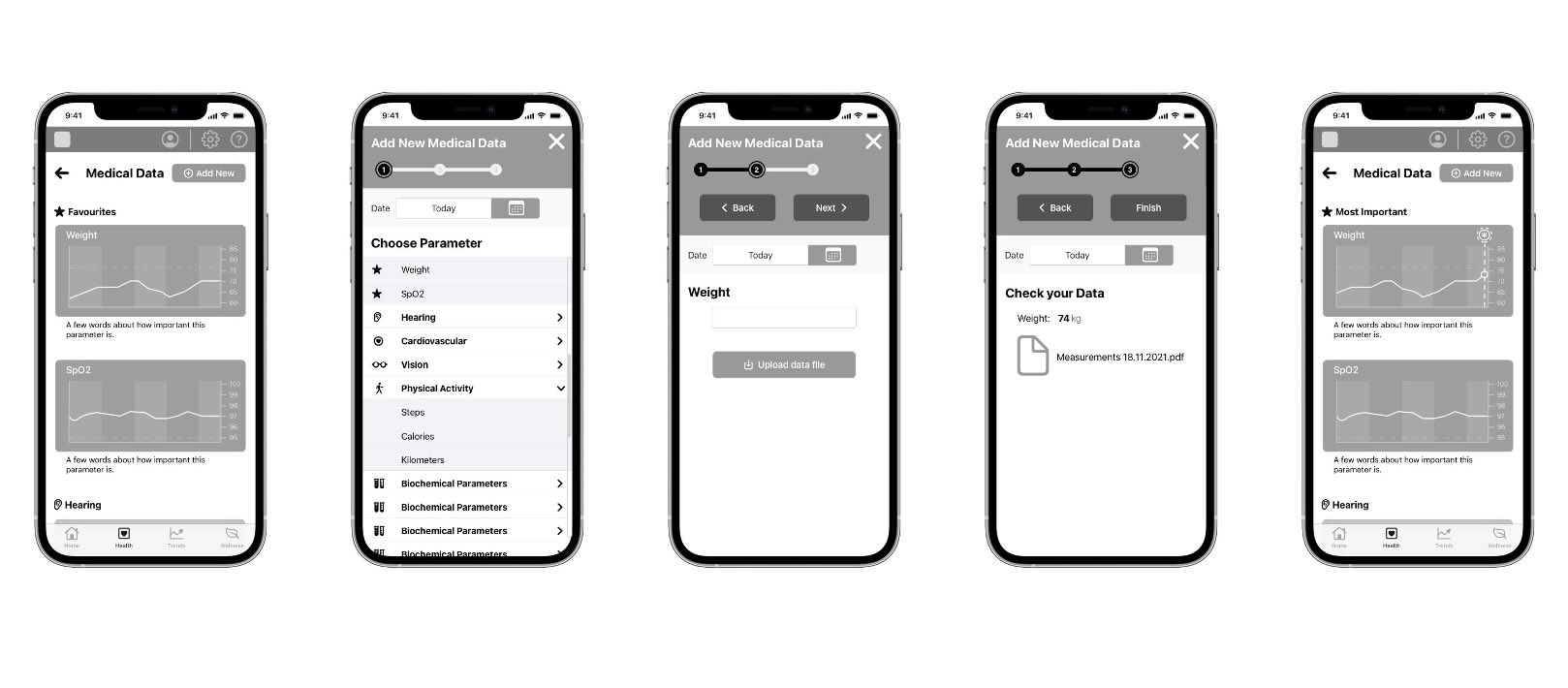
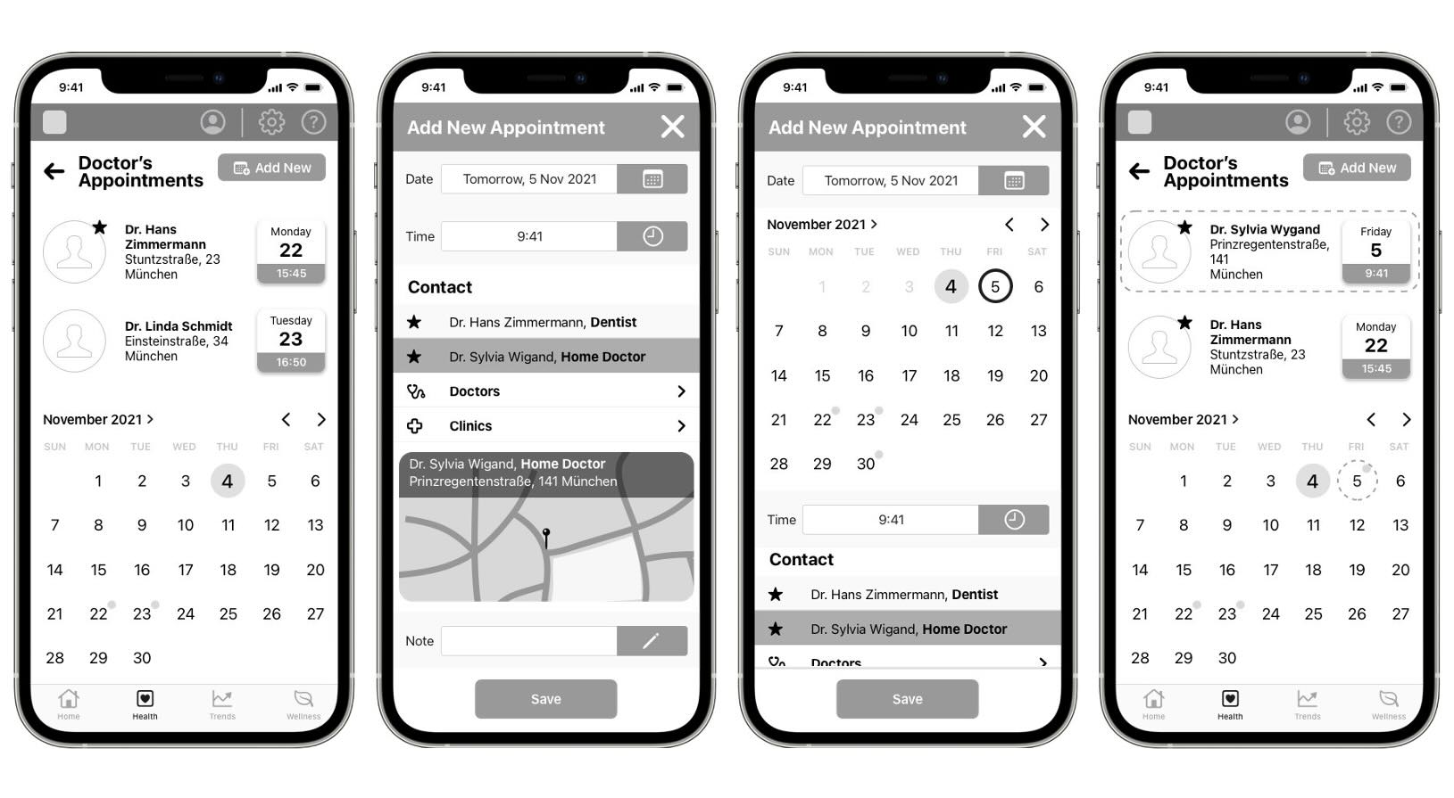
Mobile Version


Store user‘s health and Medical Information | Mobile
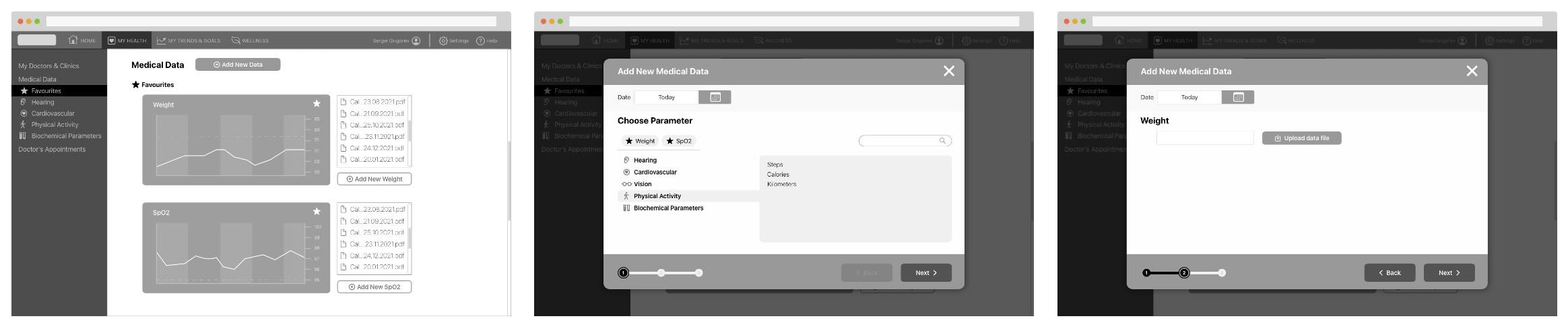
Desktop Version


Store user‘s health and Medical Information | Desktop I
Wireframes
Designing Wireframes
Following low-resolution sketches in UX design, creating wireframes is pivotal for detailed refinement and functional clarity. Wireframes specify elements and layouts, bridging the gap between initial sketches and the final design. They enhance stakeholder alignment by presenting a polished vision, support an iterative process, and prepare for user testing. This step streamlines the workflow, ensuring a cohesive evolution of the design with stakeholder input and user needs.
Mobile Version
Store user‘s health and Medical Information | Mobile
Desktop Version
Store user‘s health and Medical Information | Desktop
Usability Testing
User testing was conducted on selected scenarios using a mid-fidelity prototype and the InVision service. With the consent of the users, all testing sessions were recorded and analyzed.
Participants

Affinity Mapping


Affinity mapping | Observations
Usability test results | Rainbow Table

Usability Issues
Five issues of varying degrees of importance were identified using affinity mapping and a rainbow table:
Issue #1 (high)
- Issue: No confirmation request after the user decided to close the Wizard form with entered data.
- Suggested Change: Add confirmation request.
- Evidence: The user's data is the most valuable part of any App. Without a confirmation request it can be lost accidentally.

Issue #2 (medium)
- Issue: No functionality to directly add a parameter in the "Add parameter" form in the Mobile version.
- Suggested Change: Show the "Add parameter" button in the Mobile version.
- Evidence: It breaks the habit if the user often switches between desktop and mobile versions.

Issue #3 (medium)
- Issue: Parameters selected by user in the "Add appointment" form in the Desktop version are not clear.
- Suggested Change: Modify and unify the logic structure of the Wizards.
- Evidence: The same principle of action in similar circumstances reduces the cognitive load.
Issue #4 (low)
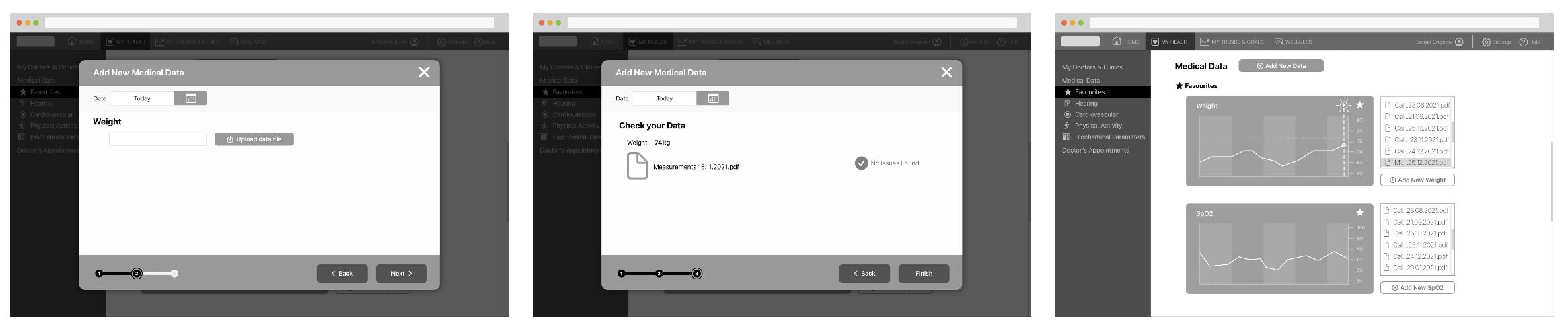
- Issue: Favorite Parameters in the "Add New Medical Data" desktop form are not correctly recognizable.
- Suggested Change: Modify the visual appearance in the desktop version.
- Evidence: A solution devised to speed up interaction actually slowed it down. Easy to fix visually.

Issue #5 (low)
- Issue: Successful data submission is not clearly confirmed in the Desktop and Mobile versions.
- Suggested Change: Add brief confirmation text.
- Evidence: Visual clues alone are not enough.

Prototypes
Interactive mobile version prototype
The Material Design 3 design system was chosen to create a fully functional prototype in Figma. All custom controls are based on existing standard elements. More relevant information for the user is available immediately, details can be viewed at once without interrupting the flow.